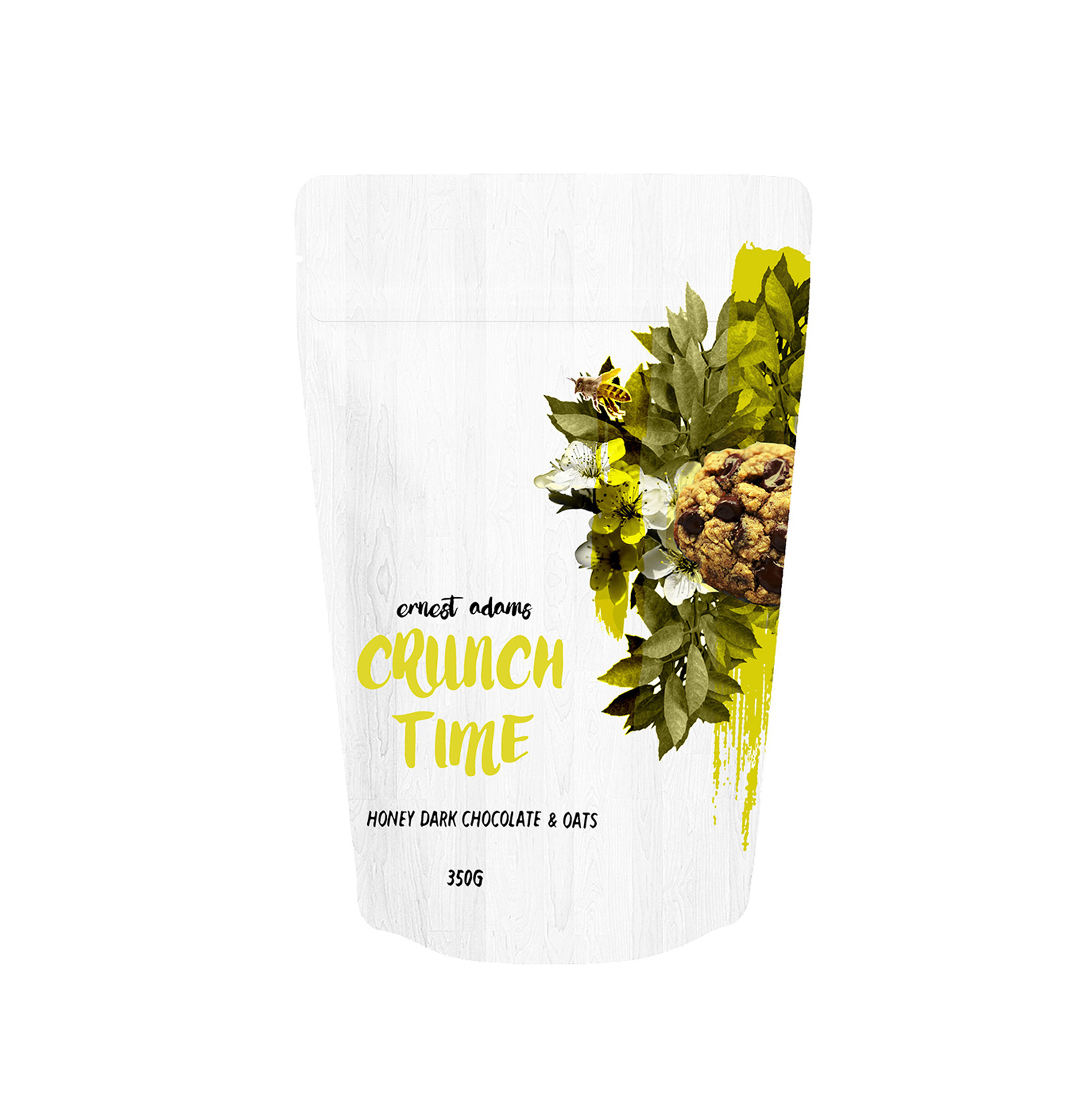
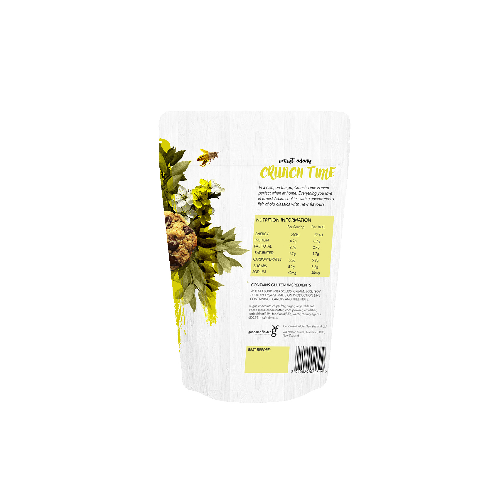
Crunch Time

Following a decline in sales for "Ernest Adams" cookies from their main competitor 'Farmbake', we were given the brief to analyse emerging macro and micro trends to reinvent the brand and improve sales. Reviewing the current packaging of Ernest Adams, we felt the image used was outdated and did not speak to its current audience. We also noted that their flavour range did not differ enough from it's competing brands. Reinventing the brand we decided to focus on urbanisation, to connect the brand with an urban professional audience who want a tasty snack to eat on the go.

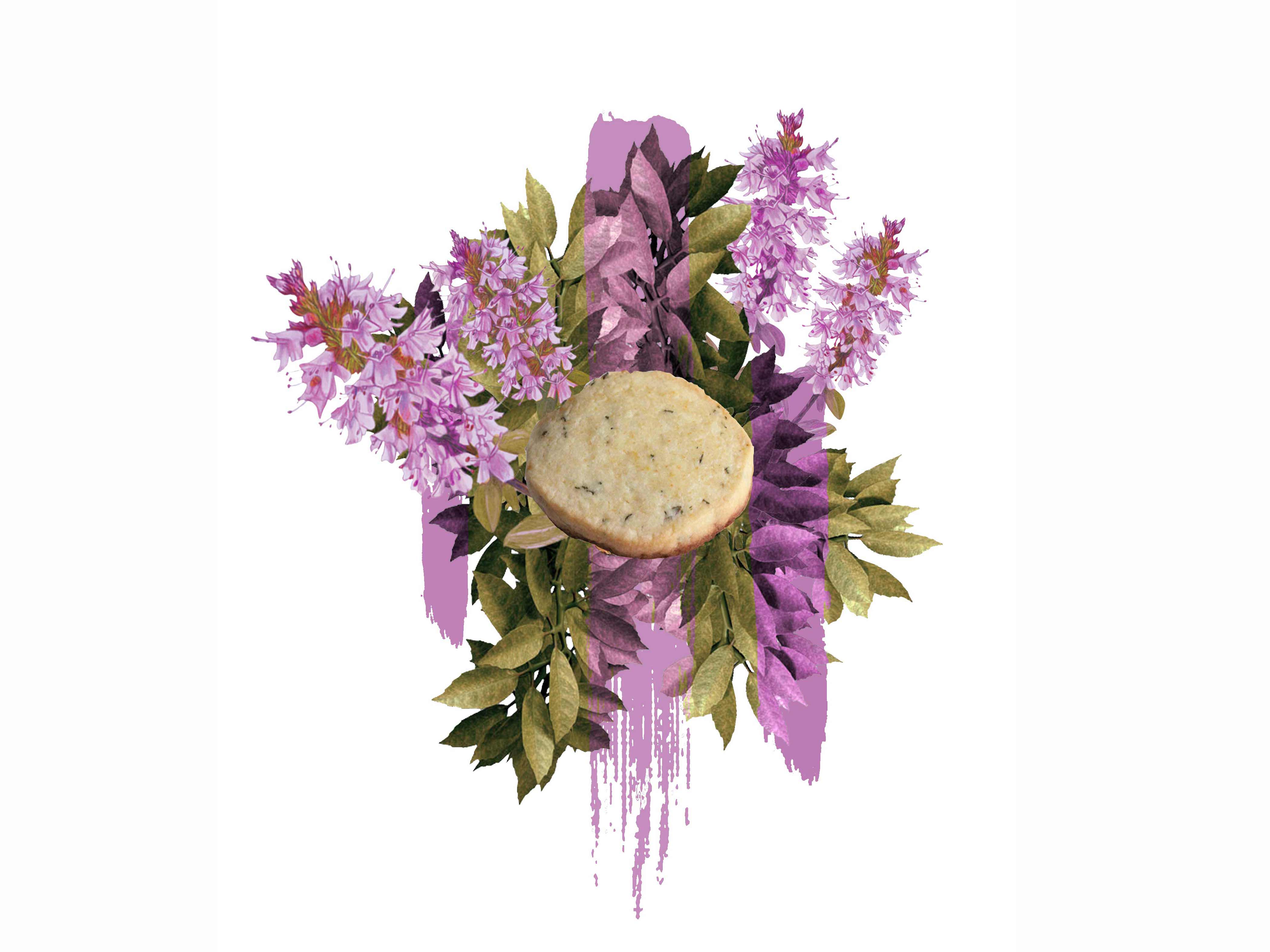
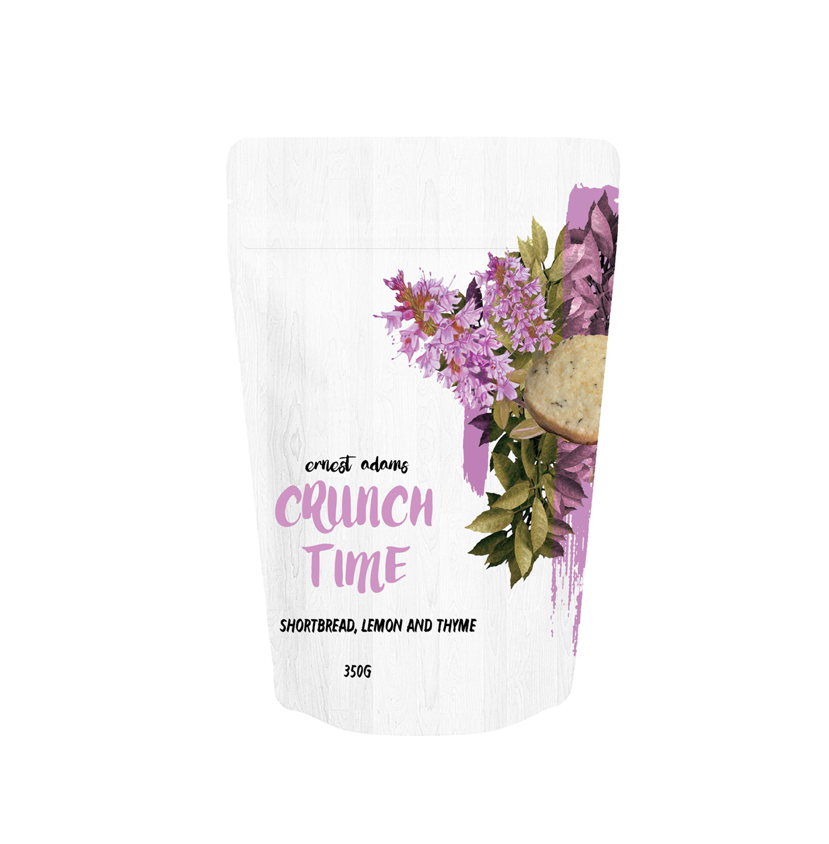
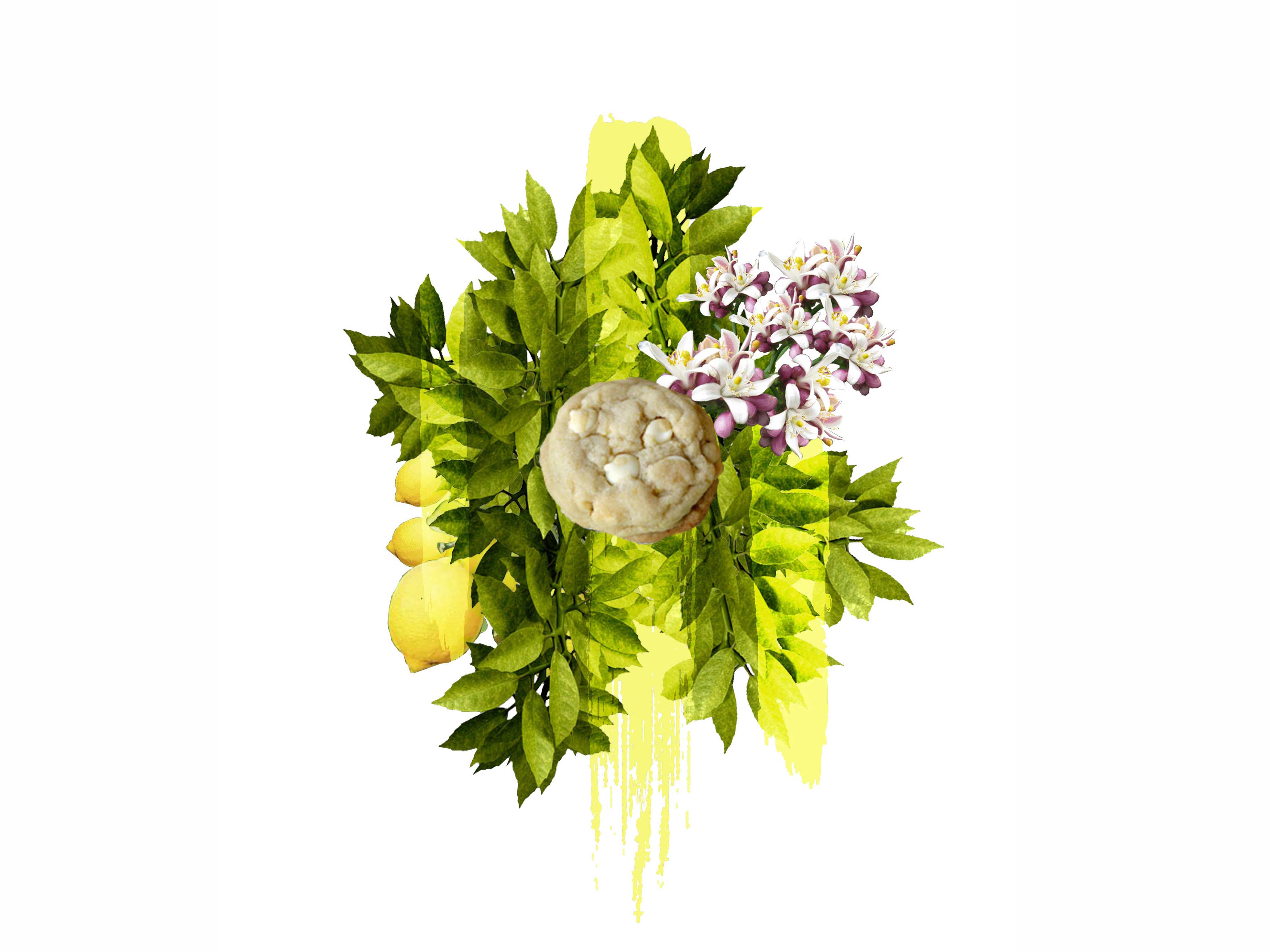
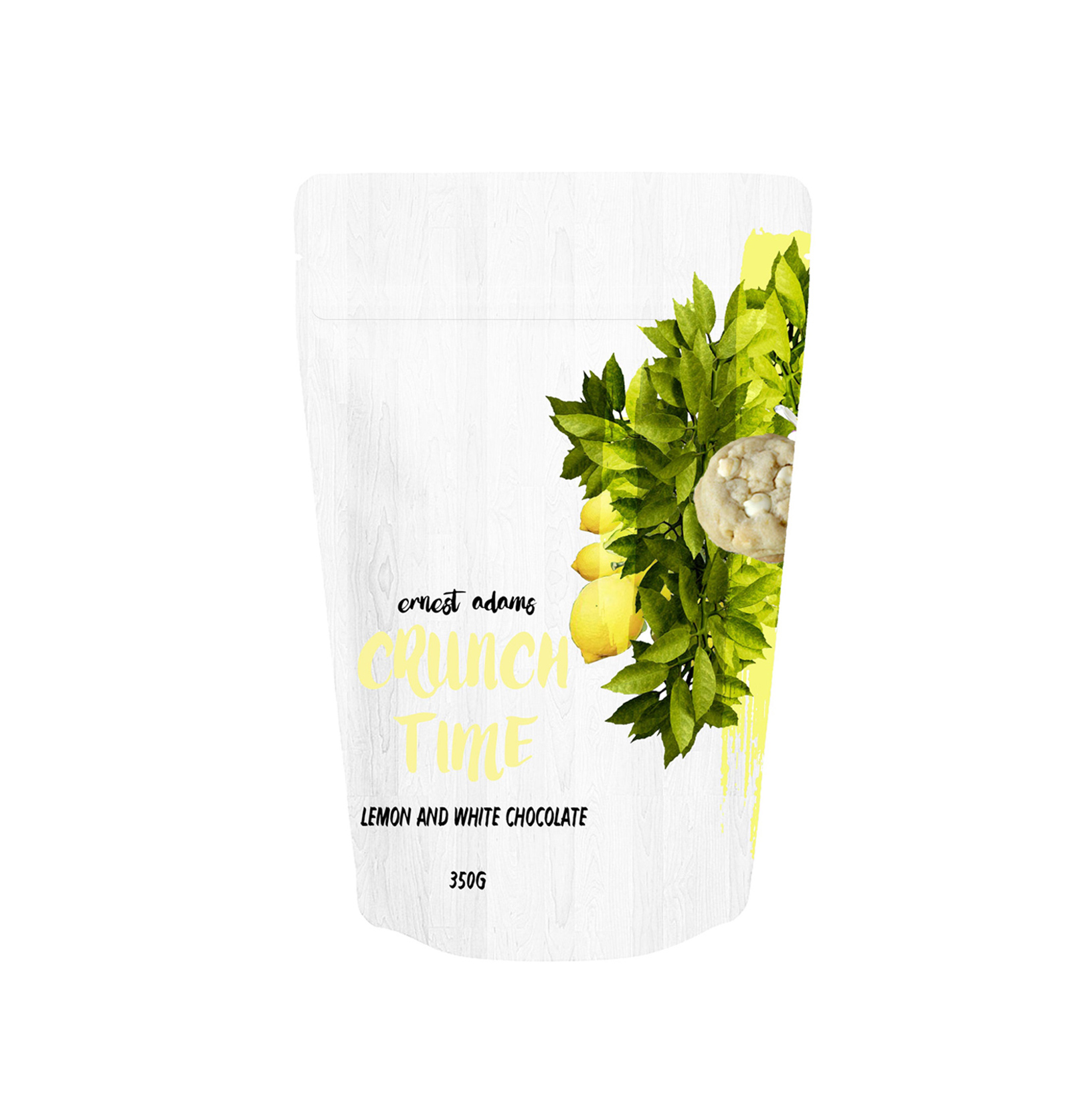
Selecting flavours first we took inspiration from the brands current range and, gave them a modern twist. The brand new flavour range includes: "White chocolate and lemon", "Dark chocolate and raspberry", "Dark chocolate, oats and honey", "Vanilla toffee", "Salted caramel and milk chocolate" and "Shortbread and thyme"

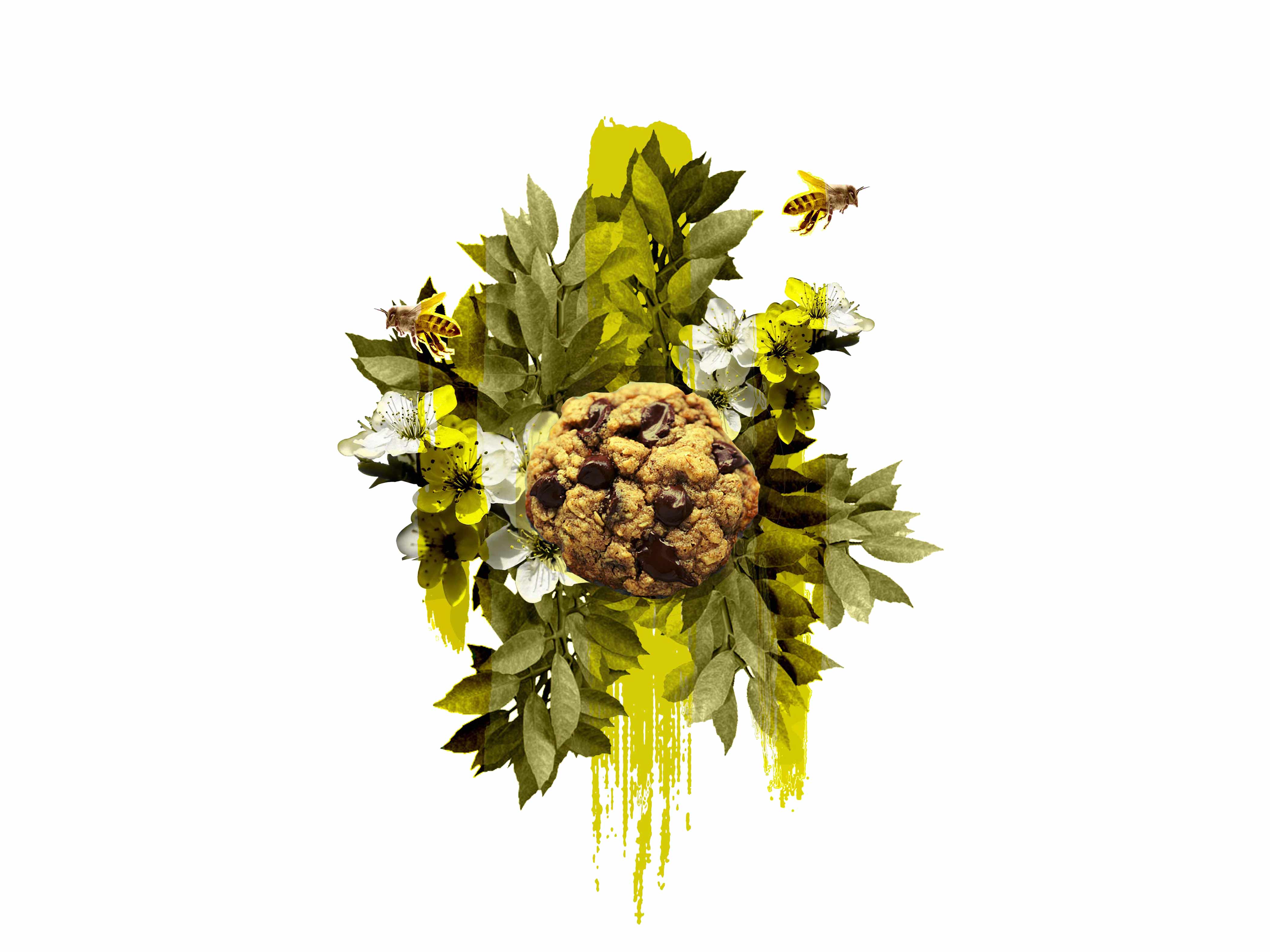
Designing the packaging we chose to emphasize the flavour of the cookie rather than the home setting, and this was created by using a collage of the cookie, and its ingredients. The colours and wooden textured background reflects an urban connection of nature to the city. To make our brand more appealing to our chosen audience, we designed resealable packaging to appeal to the on-the-go consumer. Lastly we selected the name "Crunch Time" to represent the activity, deadlines and busy nature of the city.
Crunch Time cover img crunch time honey oats and dark choclate packaging crunch time back packaging crunch time shortbread lemon and thyme crunch time shortbread lemon and thyme packaging crunch time white chocolate and lemon crunch time white chocolate and lemon packaging